Saman Maydani had been making granola for nine years before she decided to sell it. Her flavors sit at the intersection of Iranian ingredients (saffron, rose, cardamom, pistachio) and the kind of thing a farmer's market shopper picks up without quite knowing why. She came to me with a name, a timeline, and a clear instinct: it needed to feel like it belonged to two worlds at once without making either one feel like a footnote.
That turned out to be a design problem as much as a cultural one.
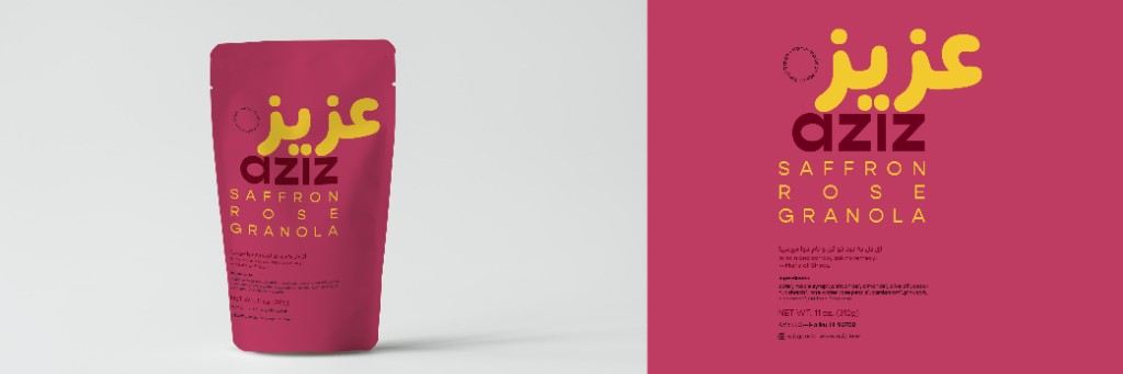
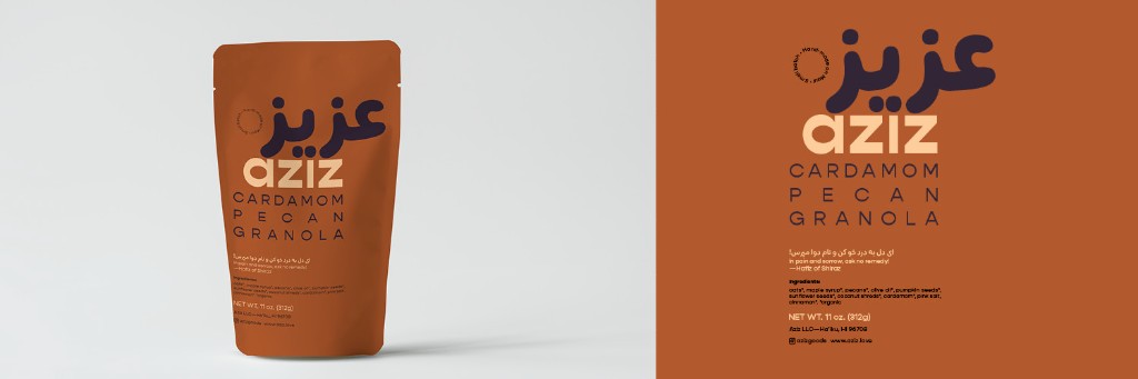
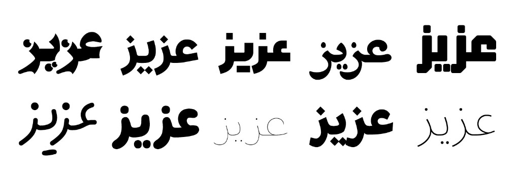
If Persian script was going to be a genuine feature of the identity, not a decorative gesture, the font choice mattered as much as anything else. A lot of Arabic-script typefaces that feel expressive to native readers come across as ornamental or hard to parse to Western eyes. After a long search we landed on Rabie, which has a roundness and warmth that reads as friendly rather than foreign, paired with Gopher for the English. The two faces work together without competing for attention.
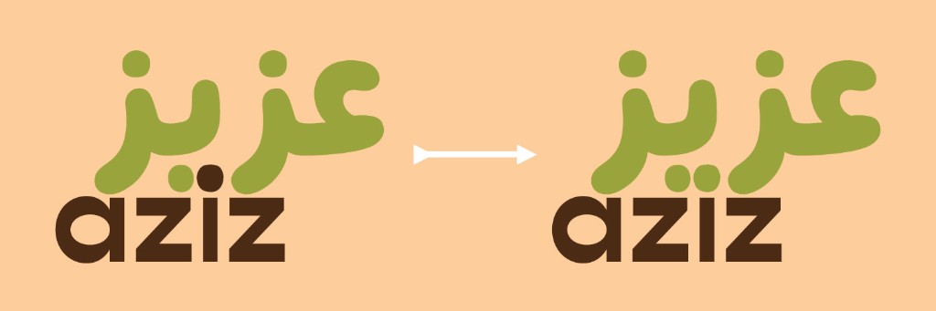
The mark came from a small typographic observation: the "ee" sound in aziz is represented by a dotted letter in both scripts. The logo shares that dot, one point of connection between two languages, two culinary traditions, two people. It's the kind of thing that looks inevitable once you see it, which is usually a sign you've found the right answer.

Each flavor has its own color drawn from the ingredients themselves: the deep gold of saffron, the pink of dried rose petals, the very particular green of a pistachio. Cardamom was the hardest. Its natural palette kept overlapping with the other flavors, until we found the deep purple of a cinnamon fruit, which turned out to carry exactly the right sense of quiet luxury.
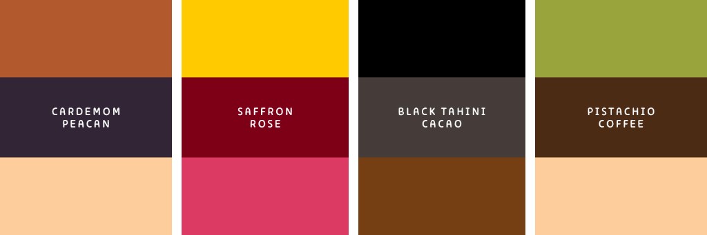
The packaging recommendation was no window, no product photography. Bold color and Persian script as the primary surface. A quote from Hafiz of Shiraz on every bag. The product doesn't need to explain itself, and the packaging shouldn't either.